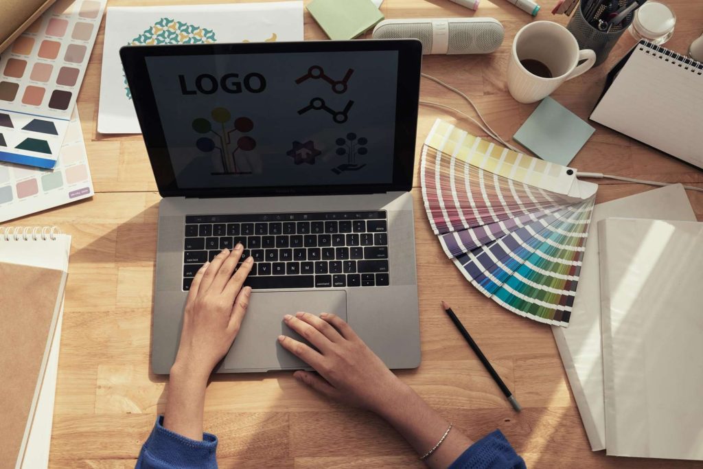
Creating a logo involves more than just designing shapes and selecting typography. It depends mainly on choosing the right logo color combination. The power and emotion of color can significantly shape your brand identity and influence how your audience perceives it. Therefore, selecting the perfect colors is crucial for your logo, as they will inform your overall visual identity across every customer choice. In this guide, a reputable professional logo design agency in the UK has provided tips to help you find the right color palette for your brand. Let’s see the world of color and discover how to make your logo stand out.
The Psychology Of Colors:
Understanding the psychology behind colors is necessary for creating an effective logo. Different colors can evoke specific emotions and associations, making them a powerful tool in branding.

1. Red: Energy And Passion –
Red is all about energy, passion, and urgency. It is a powerful, attention-grabbing color that can stimulate powerful emotions. Brands like Coca-Cola and YouTube use red to create excitement and a sense of urgency.
2. Blue: Trust And Dependability –
Blue is known for its calming and trustworthy vibes. It’s favorite in industries where trust and reliability are crucial, such as finance and technology. Think of brands like Facebook, IBM, and American Express, which use blue to convey dependability and professionalism.
3. Yellow: Happiness And warmth –
Yellow represents happiness, optimism, and warmth. It’s an eye-catching color that conveys friendliness and approachability. McDonald’s and Snapchat, for example, use yellow to create a welcoming and cheerful image.
4. Green: Freshness And Growth –
Green is associated with nature, growth, and health. It is a versatile color that symbolizes anything from eco-friendliness to financial success. Brands like Starbucks and Whole Foods use green to align with their values and promote health and sustainability.
5. Black: Elegance And Sophistication –
Black conveys elegance, sophistication, and authority. It’s a timeless color often chosen by luxury brands like Chanel and Nike to project a high-end, stylish image.

Combining Colors For Maximum Impact –
While a single color can be impactful, combining colors can create a more dynamic and versatile logo.
Here are a few tips for effective color combinations:
- Complementary Colors: Colors opposite each other on the color wheel (like blue and orange) create vibrant and eye-catching contrasts.
- Analogous Colors: Colors next to each other on the color wheel (like blue and green) offer a harmonious and visually appealing combination.
- Triadic Colors: Using three colors evenly spaced around the color wheel (like red, yellow, and blue) can provide a balanced yet vibrant look.
To conclude, choosing the right color for your business logo is a strategic decision that can influence customer perceptions and your overall brand identity. By understanding the psychology of colors and aligning them with your brand’s message, you can create a logo that stands out and deeply resonates with your audience. Looking for a custom logo design to elevate your brand in the UK? Visit MR Logo Design. We specialize in creating custom business logos that perfectly capture your brand’s essence. Let our expert graphic designers help you stand out with style!
Also Read: 5 expert tips for designing a Professional Logo for your business

Leave A Comment