
In today’s UK fitness and wellness scene, the logo is the first and last impression for any brand. Whether you run a gym or work as a personal trainer, or manage a wellness business, your logo is usually the first thing that people go to attract with. A well-planned logo can reflect your brand image along with creates an trust factor for your brand and its purpose. Moreover, a creative logo for any brand or industry can create a massive impact on business growth and recognizability. In this blog, the best Logo Design company in the UK will give you some design ideas by which you can create a stunning logo for the UK markets.
Understanding Core Design Principles for Fitness Logos
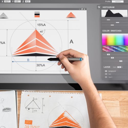
A great fitness logo is built on strong design fundamentals such as simplicity, flexibility, and relevance. Simple logos are easier to recognise and work well across different media, from billboard to social media. Maintaining proper balance and proportion keeps the design visually pleasing. Focusing on timeless elements instead of short-lived trends helps your brand stay consistent and recognisable over the long term.
Choosing Your Brand “Voice” in Logo Design
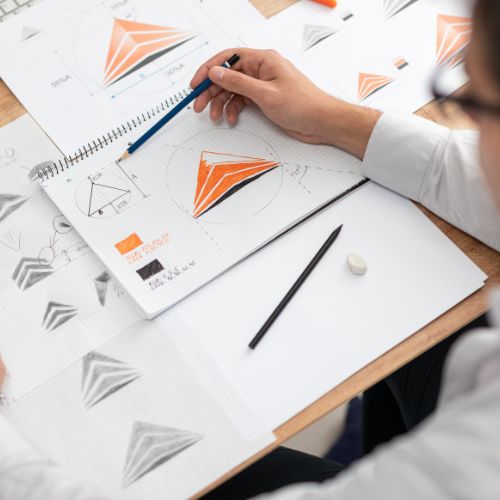
Every fitness brand has its own personality, and your logo should clearly reflect that. Some brands aim for a bold and energetic feel, while others prefer a calm and holistic approach. Elements like fonts, shapes, and colours all contribute to this “voice.” For UK audiences, aligning your design with cultural preferences and your target market helps create stronger connections and improve brand recall. If you want to create your brand identity through logo design, then you can contact the best Professional Logo Design services in the UK, and make your brand standout in the UK marketplaces.
Colour Psychology in UK Fitness Branding
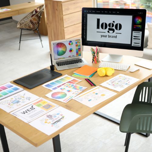
Colours strongly influence how people perceive your brand. Bright shades like red and orange often represent strength, passion, and activity, while cooler tones like blue and green are associated with trust, balance, and wellness. Choosing the right colour palette is important for standing out in the UK fitness market and building an emotional connection with your audience.
Typography and Icon Choices That Stand Out
The fonts and symbols you choose play a key role in making your logo memorable. Clean and modern typefaces, especially sans-serif fonts, are popular in the fitness industry due to their readability. Icons such as weights, movement lines, or human figures can strengthen your message. Keeping the design simple ensures your logo remains versatile and easy to recognise across different platforms. If you want to create a stunning logo using bold and unique typography, then you should contact the best Quality Logo Design services in the UK, and create a sustainable brand in the UK marketplaces.
Final Verdict
Designing an effective fitness logo requires a blend of creativity and strategy. By focusing on clear design fundamentals, a defined brand voice, and thoughtful visual choices, UK fitness businesses can create a logo that truly stands out. A strong logo not only attracts people’s eyes but also supports long-term growth by building recognition, trust, and customer loyalty. If you want to create such a stunning logo, then you can contact MR Logo Design, the best Logo Design company in the UK, and make your logo stunning for the UK audiences.
Also Read: Minimalist Yet Powerful: Crafting a Fitness Logo That Energizes
Leave A Comment