When people come across a brand for the first time, the logo is usually what captures their attention. But a great logo isn’t just attractive; it communicates who you are before a single word is spoken. This is why the psychology behind fonts and colors plays such a crucial role in logo design. When you understand how design elements influence emotions, you can create a logo that truly connects with your audience. Moreover, a brand is represented by its identity, and the logo is the first identity of any brand. This is the first gateway through which people interact with the brand’s purpose and long-term vision. In this blog, the best Professional Logo Design services in the UK will tell you how good fonts and colors make your logo stand out.
How Fonts Shape Brand Perception
Every font carries a personality of its own. Serif fonts, with their traditional strokes, often signal trust, reliability, and heritage. Sans-serif fonts feel cleaner and more modern, making them ideal for tech, startups, and lifestyle brands. Script fonts, on the other hand, bring a touch of elegance and creativity, perfect for boutique, beauty, or artistic businesses.
Choosing the right font means choosing how your audience sees you. If your brand stands for innovation, a bold and minimal style works better. If your business focuses on luxury or craftsmanship, a refined serif or script font might feel more appropriate. Beyond personality, readability is key. Your logo must remain clear whether it appears on a mobile screen, a business card, or a large billboard.
What Colors Say About Your Brand
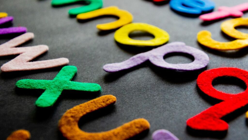
Color psychology is a powerful tool in branding. Each color sends a message and influences how people feel. For example, red reflects passion, urgency, and strength. Blue builds a sense of trust, calm, and professionalism, which is why many banks and tech brands use it. Green represents growth, health, and balance, while yellow gives off warmth and optimism. Black conveys power and sophistication, making it a favorite for premium labels.
The right color palette helps your audience instantly understand your business values. When selecting colors, think about what emotion you want your brand to evoke and how these colors will look across different platforms. If you want to create a unique logo for your brand, contact the top Custom Logo Design services in the UK to help your brand stand out in a competitive market.
Combining Fonts and Colors for Maximum Effect
A powerful logo finds the perfect harmony between its font and color choices. A bold font paired with vibrant colors creates a dynamic and energetic feel. Meanwhile, a clean font with muted tones speaks of elegance and simplicity. The goal is to ensure every design element reinforces your message, not works against it.
Avoid cluttering your logo with too many shades or overly stylish fonts. Simplicity not only enhances recognition but also makes your branding timeless.
Final Verdict
Designing a memorable logo is more than a creative task; it’s a strategic decision. When you combine the right fonts and colors with a clear understanding of your brand identity, you create a visual symbol that builds trust, recognition, and long-term impact. A thoughtful logo doesn’t just look good; it speaks for your business every day. Moreover, business stands out with the presentation of your purpose and vision, and the logo is the visual presentation of your business. So if you want to make your business stand out with visual elements, then you can contact MR Logo Design, the best Quality Logo Design company in the UK, and make your business stand out on the global platform.
Also Read: Stand Out With Style: Best Color Choices For Business Logos
Leave A Comment